LineChart

Inherits: LayoutControl
Properties
-
animation(AnimationValue) –Controls chart implicit animation.
-
baseline_x(Number | None) –Baseline value for X axis.
-
baseline_y(Number | None) –Baseline value for Y axis.
-
bgcolor(ColorValue | None) –Background color of the chart.
-
border(Border | None) –The border around the chart.
-
bottom_axis(ChartAxis) –Defines the appearance of the bottom axis, its title and labels.
-
data_series(list[LineChartData]) –A list of
LineChartData -
horizontal_grid_lines(ChartGridLines | None) –Controls drawing of chart's horizontal lines.
-
interactive(bool) –Enables automatic tooltips and points highlighting when hovering over the chart.
-
left_axis(ChartAxis) –Defines the appearance of the left axis, its title and labels.
-
max_x(Number | None) –Defines the maximum displayed value for X axis.
-
max_y(Number | None) –Defines the maximum displayed value for Y axis.
-
min_x(Number | None) –Defines the minimum displayed value for X axis.
-
min_y(Number | None) –Defines the minimum displayed value for Y axis.
-
point_line_end(Number | None) –The end of the vertical line drawn at selected point position.
-
point_line_start(Number | None) –The start of the vertical line drawn under the selected point.
-
right_axis(ChartAxis) –Defines the appearance of the right axis, its title and labels.
-
tooltip(LineChartTooltip | None) –The tooltip configuration for this chart.
-
top_axis(ChartAxis) –Defines the appearance of the top axis, its title and labels.
-
vertical_grid_lines(ChartGridLines | None) –Controls drawing of chart's vertical lines.
Events
-
on_event(EventHandler[LineChartEvent] | None) –Fires when a chart line is hovered or clicked.
Examples#
Example 1#
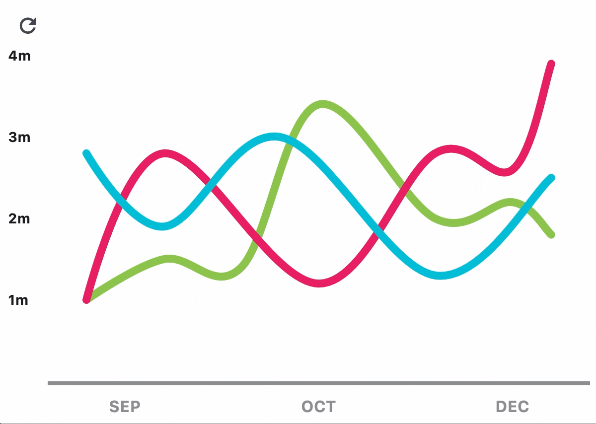
import flet as ft

import flet_charts as fch


class State:
    toggled = True


state = State()


def main(page: ft.Page):
    data_1 = [
        fch.LineChartData(
            stroke_width=8,
            color=ft.Colors.LIGHT_GREEN,
            curved=True,
            rounded_stroke_cap=True,
            points=[
                fch.LineChartDataPoint(1, 1),
                fch.LineChartDataPoint(3, 1.5),
                fch.LineChartDataPoint(5, 1.4),
                fch.LineChartDataPoint(7, 3.4),
                fch.LineChartDataPoint(10, 2),
                fch.LineChartDataPoint(12, 2.2),
                fch.LineChartDataPoint(13, 1.8),
            ],
        ),
        fch.LineChartData(
            color=ft.Colors.PINK,
            below_line_bgcolor=ft.Colors.with_opacity(0, ft.Colors.PINK),
            stroke_width=8,
            curved=True,
            rounded_stroke_cap=True,
            points=[
                fch.LineChartDataPoint(1, 1),
                fch.LineChartDataPoint(3, 2.8),
                fch.LineChartDataPoint(7, 1.2),
                fch.LineChartDataPoint(10, 2.8),
                fch.LineChartDataPoint(12, 2.6),
                fch.LineChartDataPoint(13, 3.9),
            ],
        ),
        fch.LineChartData(
            color=ft.Colors.CYAN,
            stroke_width=8,
            curved=True,
            rounded_stroke_cap=True,
            points=[
                fch.LineChartDataPoint(1, 2.8),
                fch.LineChartDataPoint(3, 1.9),
                fch.LineChartDataPoint(6, 3),
                fch.LineChartDataPoint(10, 1.3),
                fch.LineChartDataPoint(13, 2.5),
            ],
        ),
    ]

    data_2 = [
        fch.LineChartData(
            stroke_width=4,
            color=ft.Colors.with_opacity(0.5, ft.Colors.LIGHT_GREEN),
            rounded_stroke_cap=True,
            points=[
                fch.LineChartDataPoint(1, 1),
                fch.LineChartDataPoint(3, 4),
                fch.LineChartDataPoint(5, 1.8),
                fch.LineChartDataPoint(7, 5),
                fch.LineChartDataPoint(10, 2),
                fch.LineChartDataPoint(12, 2.2),
                fch.LineChartDataPoint(13, 1.8),
            ],
        ),
        fch.LineChartData(
            color=ft.Colors.with_opacity(0.5, ft.Colors.PINK),
            below_line_bgcolor=ft.Colors.with_opacity(0.2, ft.Colors.PINK),
            stroke_width=4,
            curved=True,
            rounded_stroke_cap=True,
            points=[
                fch.LineChartDataPoint(1, 1),
                fch.LineChartDataPoint(3, 2.8),
                fch.LineChartDataPoint(7, 1.2),
                fch.LineChartDataPoint(10, 2.8),
                fch.LineChartDataPoint(12, 2.6),
                fch.LineChartDataPoint(13, 3.9),
            ],
        ),
        fch.LineChartData(
            color=ft.Colors.with_opacity(0.5, ft.Colors.CYAN),
            stroke_width=4,
            rounded_stroke_cap=True,
            points=[
                fch.LineChartDataPoint(1, 3.8),
                fch.LineChartDataPoint(3, 1.9),
                fch.LineChartDataPoint(6, 5),
                fch.LineChartDataPoint(10, 3.3),
                fch.LineChartDataPoint(13, 4.5),
            ],
        ),
    ]

    chart = fch.LineChart(
        data_series=data_1,
        border=ft.Border(
            bottom=ft.BorderSide(4, ft.Colors.with_opacity(0.5, ft.Colors.ON_SURFACE))
        ),
        tooltip=fch.LineChartTooltip(
            bgcolor=ft.Colors.with_opacity(0.8, ft.Colors.BLUE_GREY)
        ),
        min_y=0,
        max_y=4,
        min_x=0,
        max_x=14,
        expand=True,
        right_axis=fch.ChartAxis(show_labels=False),
        left_axis=fch.ChartAxis(
            label_size=40,
            labels=[
                fch.ChartAxisLabel(
                    value=1,
                    label=ft.Text("1m", size=14, weight=ft.FontWeight.BOLD),
                ),
                fch.ChartAxisLabel(
                    value=2,
                    label=ft.Text("2m", size=14, weight=ft.FontWeight.BOLD),
                ),
                fch.ChartAxisLabel(
                    value=3,
                    label=ft.Text("3m", size=14, weight=ft.FontWeight.BOLD),
                ),
                fch.ChartAxisLabel(
                    value=4,
                    label=ft.Text("4m", size=14, weight=ft.FontWeight.BOLD),
                ),
                fch.ChartAxisLabel(
                    value=5,
                    label=ft.Text("5m", size=14, weight=ft.FontWeight.BOLD),
                ),
                fch.ChartAxisLabel(
                    value=6,
                    label=ft.Text("6m", size=14, weight=ft.FontWeight.BOLD),
                ),
            ],
        ),
        bottom_axis=fch.ChartAxis(
            label_size=32,
            labels=[
                fch.ChartAxisLabel(
                    value=2,
                    label=ft.Container(
                        margin=ft.Margin(top=10),
                        content=ft.Text(
                            value="SEP",
                            size=16,
                            weight=ft.FontWeight.BOLD,
                            color=ft.Colors.with_opacity(0.5, ft.Colors.ON_SURFACE),
                        ),
                    ),
                ),
                fch.ChartAxisLabel(
                    value=7,
                    label=ft.Container(
                        margin=ft.Margin(top=10),
                        content=ft.Text(
                            value="OCT",
                            size=16,
                            weight=ft.FontWeight.BOLD,
                            color=ft.Colors.with_opacity(0.5, ft.Colors.ON_SURFACE),
                        ),
                    ),
                ),
                fch.ChartAxisLabel(
                    value=12,
                    label=ft.Container(
                        margin=ft.Margin(top=10),
                        content=ft.Text(
                            value="DEC",
                            size=16,
                            weight=ft.FontWeight.BOLD,
                            color=ft.Colors.with_opacity(0.5, ft.Colors.ON_SURFACE),
                        ),
                    ),
                ),
            ],
        ),
    )

    def toggle_data(e: ft.Event[ft.IconButton]):
        if state.toggled:
            chart.data_series = data_2
            chart.data_series[2].point = True
            chart.max_y = 6
            chart.interactive = False
        else:
            chart.data_series = data_1
            chart.max_y = 4
            chart.interactive = True
        state.toggled = not state.toggled
        chart.update()

    page.add(ft.IconButton(ft.Icons.REFRESH, on_click=toggle_data), chart)


ft.run(main)
Example 2#
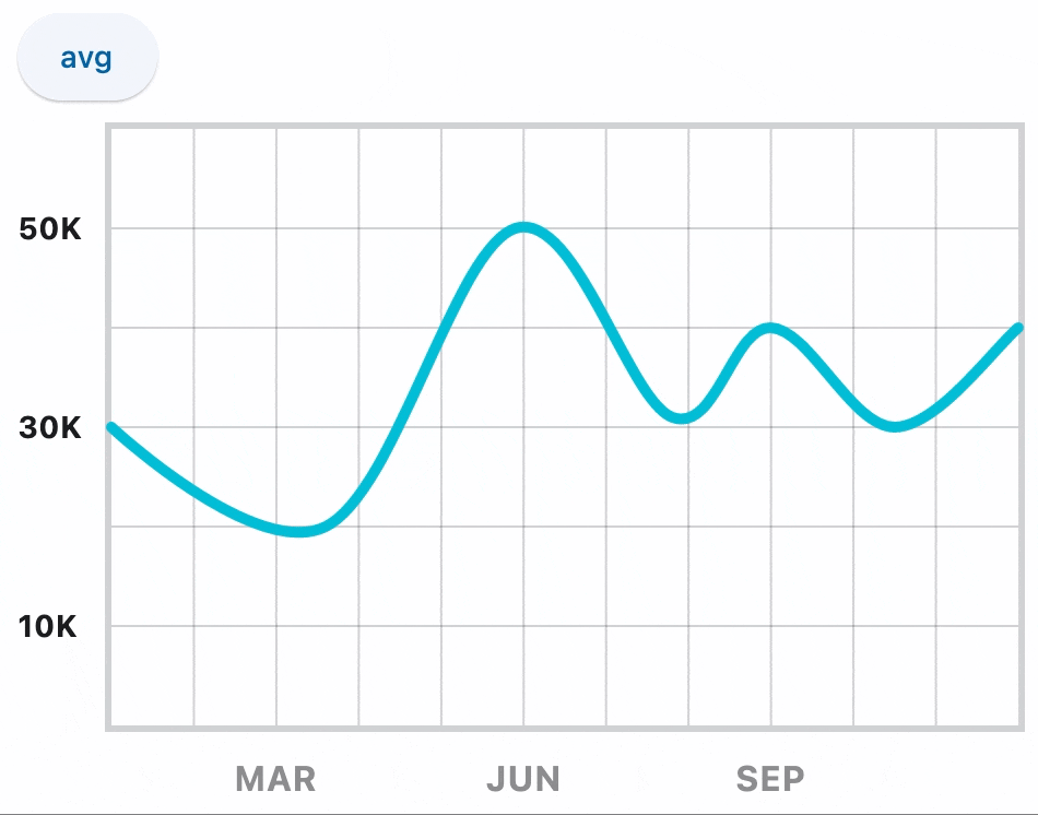
import flet as ft

import flet_charts as fch


class State:
    toggled = True


state = State()


def main(page: ft.Page):
    data_1 = [
        fch.LineChartData(
            stroke_width=5,
            color=ft.Colors.CYAN,
            curved=True,
            rounded_stroke_cap=True,
            points=[
                fch.LineChartDataPoint(0, 3),
                fch.LineChartDataPoint(2.6, 2),
                fch.LineChartDataPoint(4.9, 5),
                fch.LineChartDataPoint(6.8, 3.1),
                fch.LineChartDataPoint(8, 4),
                fch.LineChartDataPoint(9.5, 3),
                fch.LineChartDataPoint(11, 4),
            ],
        )
    ]

    data_2 = [
        fch.LineChartData(
            stroke_width=5,
            color=ft.Colors.CYAN,
            curved=True,
            rounded_stroke_cap=True,
            points=[
                fch.LineChartDataPoint(0, 3.44),
                fch.LineChartDataPoint(2.6, 3.44),
                fch.LineChartDataPoint(4.9, 3.44),
                fch.LineChartDataPoint(6.8, 3.44),
                fch.LineChartDataPoint(8, 3.44),
                fch.LineChartDataPoint(9.5, 3.44),
                fch.LineChartDataPoint(11, 3.44),
            ],
        )
    ]

    chart = fch.LineChart(
        expand=True,
        data_series=data_1,
        min_y=0,
        max_y=6,
        min_x=0,
        max_x=11,
        border=ft.Border.all(3, ft.Colors.with_opacity(0.2, ft.Colors.ON_SURFACE)),
        horizontal_grid_lines=fch.ChartGridLines(
            interval=1, color=ft.Colors.with_opacity(0.2, ft.Colors.ON_SURFACE), width=1
        ),
        vertical_grid_lines=fch.ChartGridLines(
            interval=1, color=ft.Colors.with_opacity(0.2, ft.Colors.ON_SURFACE), width=1
        ),
        tooltip=fch.LineChartTooltip(
            bgcolor=ft.Colors.with_opacity(0.8, ft.Colors.BLUE_GREY)
        ),
        left_axis=fch.ChartAxis(
            label_size=40,
            labels=[
                fch.ChartAxisLabel(
                    value=1,
                    label=ft.Text("10K", size=14, weight=ft.FontWeight.BOLD),
                ),
                fch.ChartAxisLabel(
                    value=3,
                    label=ft.Text("30K", size=14, weight=ft.FontWeight.BOLD),
                ),
                fch.ChartAxisLabel(
                    value=5,
                    label=ft.Text("50K", size=14, weight=ft.FontWeight.BOLD),
                ),
            ],
        ),
        bottom_axis=fch.ChartAxis(
            label_size=32,
            labels=[
                fch.ChartAxisLabel(
                    value=2,
                    label=ft.Container(
                        margin=ft.Margin(top=10),
                        content=ft.Text(
                            value="MAR",
                            size=16,
                            weight=ft.FontWeight.BOLD,
                            color=ft.Colors.with_opacity(0.5, ft.Colors.ON_SURFACE),
                        ),
                    ),
                ),
                fch.ChartAxisLabel(
                    value=5,
                    label=ft.Container(
                        margin=ft.Margin(top=10),
                        content=ft.Text(
                            value="JUN",
                            size=16,
                            weight=ft.FontWeight.BOLD,
                            color=ft.Colors.with_opacity(0.5, ft.Colors.ON_SURFACE),
                        ),
                    ),
                ),
                fch.ChartAxisLabel(
                    value=8,
                    label=ft.Container(
                        margin=ft.Margin(top=10),
                        content=ft.Text(
                            value="SEP",
                            size=16,
                            weight=ft.FontWeight.BOLD,
                            color=ft.Colors.with_opacity(0.5, ft.Colors.ON_SURFACE),
                        ),
                    ),
                ),
            ],
        ),
    )

    def toggle_data(e: ft.Event[ft.ElevatedButton]):
        if state.toggled:
            chart.data_series = data_2
            chart.interactive = False
        else:
            chart.data_series = data_1
            chart.interactive = True
        state.toggled = not state.toggled
        chart.update()

    page.add(ft.ElevatedButton("avg", on_click=toggle_data), chart)


ft.run(main)
Properties#
animation: AnimationValue = field(
    default_factory=lambda: Animation(
        duration=Duration(milliseconds=150), curve=LINEAR
    )
)
Controls chart implicit animation.
Defines the appearance of the bottom axis, its title and labels.
data_series: list[LineChartData] = field(
    default_factory=list
)
A list of LineChartData
controls drawn as separate lines on a chart.
horizontal_grid_lines: ChartGridLines | None = None
Controls drawing of chart's horizontal lines.
interactive: bool = True
Enables automatic tooltips and points highlighting when hovering over the chart.
Defines the appearance of the left axis, its title and labels.
point_line_end: Number | None = None
The end of the vertical line drawn at selected point position.
Defaults to data point's y value.
point_line_start: Number | None = None
The start of the vertical line drawn under the selected point.
Defaults to chart's bottom edge.
Defines the appearance of the right axis, its title and labels.
tooltip: LineChartTooltip | None = field(
    default_factory=lambda: LineChartTooltip()
)
The tooltip configuration for this chart.
If set to None, no tooltips will be shown throughout this chart.
Defines the appearance of the top axis, its title and labels.
vertical_grid_lines: ChartGridLines | None = None
Controls drawing of chart's vertical lines.
Events#
on_event: EventHandler[LineChartEvent] | None = None
Fires when a chart line is hovered or clicked.