MatplotlibChart
Displays a Matplotlib chart.
Warning
This control requires the matplotlib
Python package to be installed.
See this installation guide for more information.
Inherits: GestureDetector
Properties
-
figure(Figure) –Matplotlib figure to draw - an instance of
Events
-
on_message(EventHandler[MatplotlibChartMessageEvent] | None) –The event is triggered on figure message update.
-
on_toolbar_buttons_update(EventHandler[MatplotlibChartToolbarButtonsUpdateEvent] | None) –Triggers when toolbar buttons status is updated.
Methods
-
back– -
build– -
download– -
forward– -
home– -
on_canvas_resize– -
pan– -
send_binary– -
send_json– -
send_message– -
will_unmount– -
zoom–
Examples#
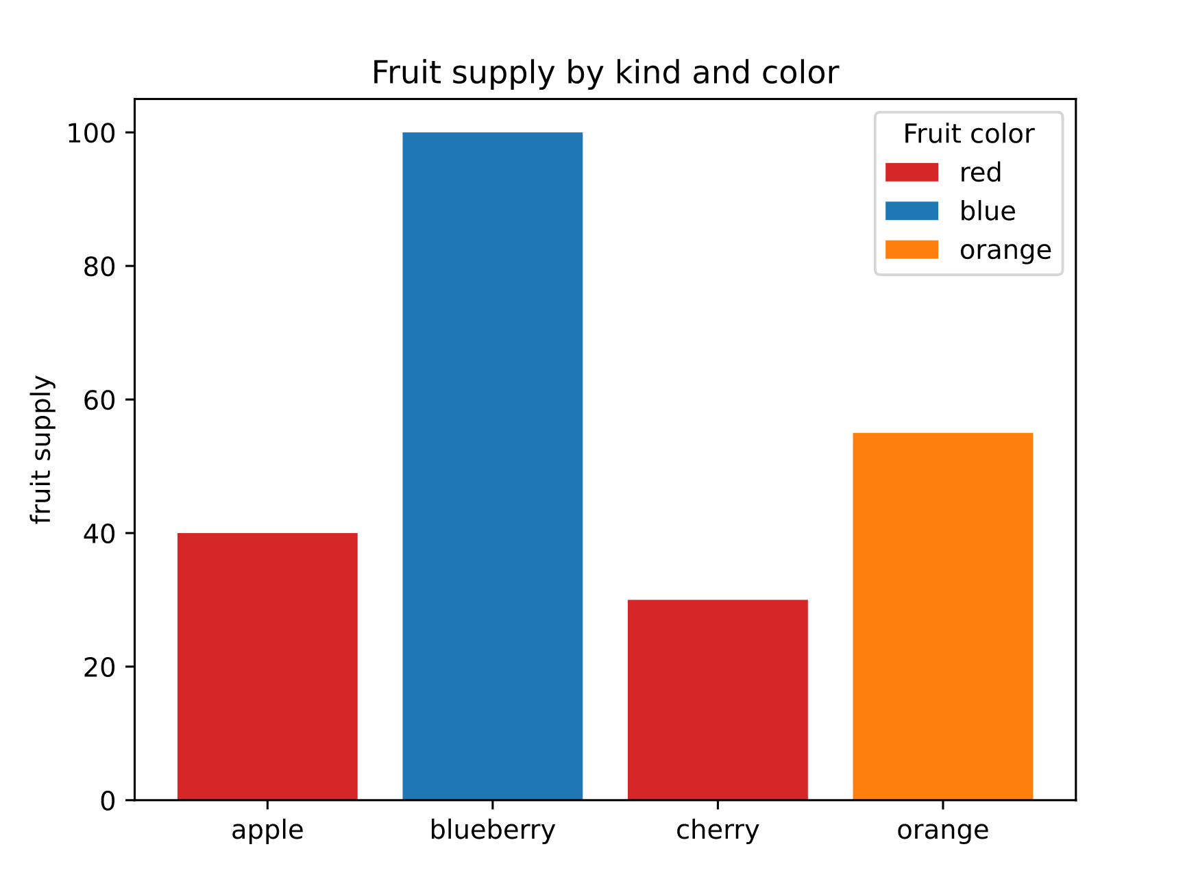
Example 1#
Based on an official Matplotlib example.
import flet as ft
import matplotlib
import matplotlib.pyplot as plt

import flet_charts as fch

matplotlib.use("svg")


def main(page: ft.Page):

    fig, ax = plt.subplots()

    fruits = ["apple", "blueberry", "cherry", "orange"]
    counts = [40, 100, 30, 55]
    bar_labels = ["red", "blue", "_red", "orange"]
    bar_colors = ["tab:red", "tab:blue", "tab:red", "tab:orange"]

    ax.bar(fruits, counts, label=bar_labels, color=bar_colors)

    ax.set_ylabel("fruit supply")
    ax.set_title("Fruit supply by kind and color")
    ax.legend(title="Fruit color")

    page.add(fch.MatplotlibChart(figure=fig, expand=True))


ft.run(main)
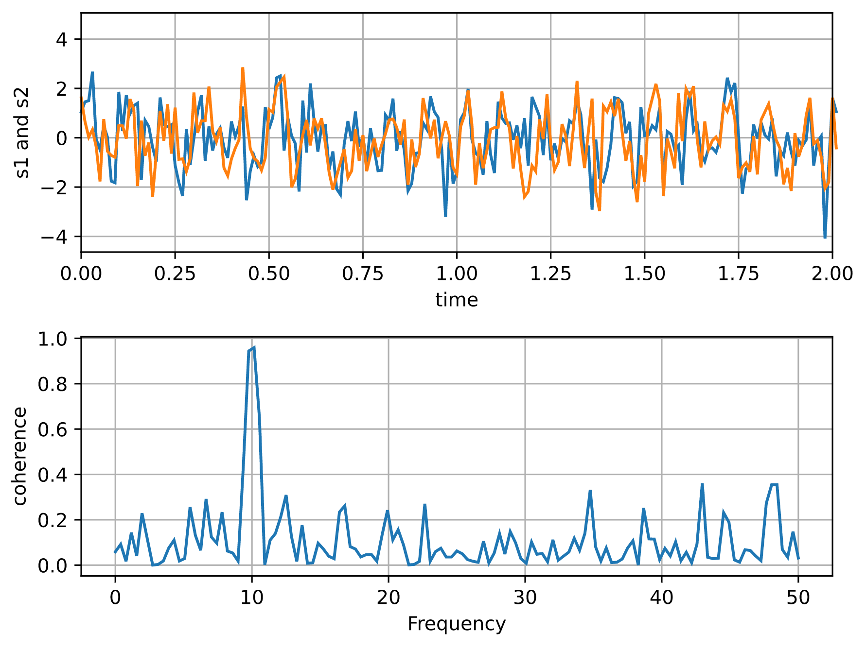
Example 2#
Based on an official Matplotlib example.
import flet as ft
import matplotlib
import matplotlib.pyplot as plt
import numpy as np

import flet_charts as fch

matplotlib.use("svg")


def main(page: ft.Page):

    # Fixing random state for reproducibility
    np.random.seed(19680801)

    dt = 0.01
    t = np.arange(0, 30, dt)
    nse1 = np.random.randn(len(t))  # white noise 1
    nse2 = np.random.randn(len(t))  # white noise 2

    # Two signals with a coherent part at 10Hz and a random part
    s1 = np.sin(2 * np.pi * 10 * t) + nse1
    s2 = np.sin(2 * np.pi * 10 * t) + nse2

    fig, axs = plt.subplots(2, 1)
    axs[0].plot(t, s1, t, s2)
    axs[0].set_xlim(0, 2)
    axs[0].set_xlabel("time")
    axs[0].set_ylabel("s1 and s2")
    axs[0].grid(True)

    cxy, f = axs[1].cohere(s1, s2, 256, 1.0 / dt)
    axs[1].set_ylabel("coherence")

    fig.tight_layout()

    page.add(fch.MatplotlibChart(figure=fig, expand=True))


ft.run(main)
Properties#
figure: Figure = field(metadata={'skip': True})
Matplotlib figure to draw - an instance of
matplotlib.figure.Figure.
Events#
on_message: (
    EventHandler[MatplotlibChartMessageEvent] | None
) = None
The event is triggered on figure message update.
on_toolbar_buttons_update: (
    EventHandler[MatplotlibChartToolbarButtonsUpdateEvent]
    | None
) = None
Triggers when toolbar buttons status is updated.