PlotlyChart
Displays a Plotly chart.
Warning
This control requires the plotly Python
package to be installed.
See this installation guide for more information.
Inherits: Container
Properties
-
figure(Figure) –Plotly figure to draw.
-
original_size(bool) –Whether to display this chart in original size.
Examples#
Example 1#
Based on an official Plotly example.
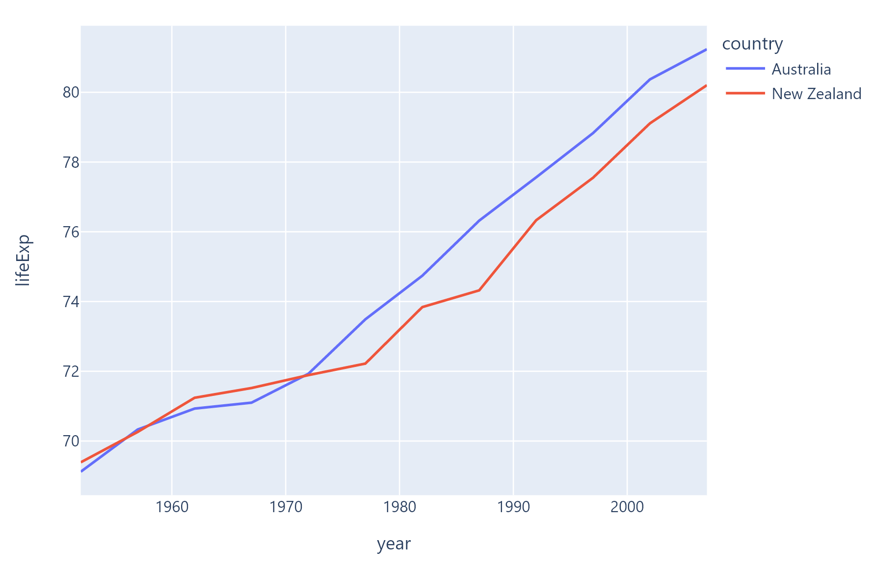
import flet as ft
import plotly.express as px

import flet_charts as fch


def main(page: ft.Page):

    df = px.data.gapminder().query("continent=='Oceania'")
    fig = px.line(df, x="year", y="lifeExp", color="country")

    page.add(fch.PlotlyChart(figure=fig, expand=True))


ft.run(main)
Example 2#
Based on an official Plotly example.
import flet as ft
import plotly.express as px

import flet_charts as fch


def main(page: ft.Page):

    df = px.data.gapminder().query("continent == 'Oceania'")
    fig = px.bar(
        df,
        x="year",
        y="pop",
        hover_data=["lifeExp", "gdpPercap"],
        color="country",
        labels={"pop": "population of Canada"},
        height=400,
    )

    page.add(fch.PlotlyChart(figure=fig, expand=True))


ft.run(main)
Example 3#
Based on an official Plotly example.

import flet as ft
import plotly.graph_objects as go

import flet_charts as fch


def main(page: ft.Page):

    labels = ["Oxygen", "Hydrogen", "Carbon_Dioxide", "Nitrogen"]
    values = [4500, 2500, 1053, 500]

    fig = go.Figure(data=[go.Pie(labels=labels, values=values)])

    page.add(fch.PlotlyChart(figure=fig, expand=True))


ft.run(main)
Example 4#
Based on an official Plotly example.
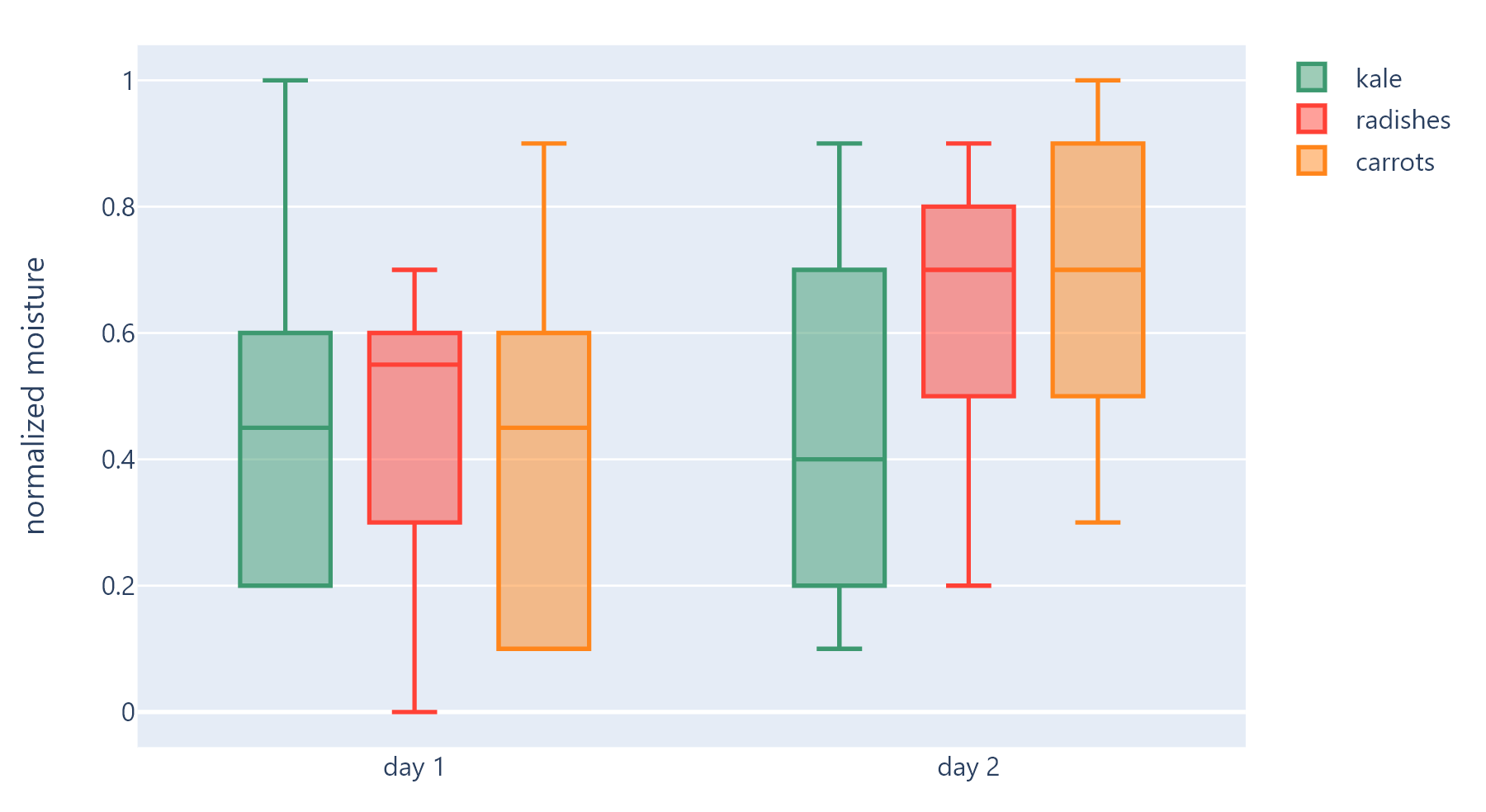
import flet as ft
import plotly.graph_objects as go

import flet_charts as fch


def main(page: ft.Page):

    x = [
        "day 1",
        "day 1",
        "day 1",
        "day 1",
        "day 1",
        "day 1",
        "day 2",
        "day 2",
        "day 2",
        "day 2",
        "day 2",
        "day 2",
    ]

    fig = go.Figure()

    fig.add_trace(
        go.Box(
            y=[0.2, 0.2, 0.6, 1.0, 0.5, 0.4, 0.2, 0.7, 0.9, 0.1, 0.5, 0.3],
            x=x,
            name="kale",
            marker_color="#3D9970",
        )
    )
    fig.add_trace(
        go.Box(
            y=[0.6, 0.7, 0.3, 0.6, 0.0, 0.5, 0.7, 0.9, 0.5, 0.8, 0.7, 0.2],
            x=x,
            name="radishes",
            marker_color="#FF4136",
        )
    )
    fig.add_trace(
        go.Box(
            y=[0.1, 0.3, 0.1, 0.9, 0.6, 0.6, 0.9, 1.0, 0.3, 0.6, 0.8, 0.5],
            x=x,
            name="carrots",
            marker_color="#FF851B",
        )
    )

    fig.update_layout(
        yaxis_title="normalized moisture",
        boxmode="group",  # group together boxes of the different traces for each value of x
    )

    page.add(fch.PlotlyChart(figure=fig, expand=True))


ft.run(main)